

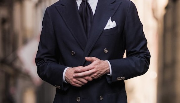
The right navy for business
For business or generally formal suits, colour is pretty simple – but there are still a few ways to make sure it’s just right.
The standard colours are navy and grey, and for good reason: no other colours can both look smart and flatter a man’s skin tone at the same time. Black is too harsh; brown isn’t smart enough; tan is downright casual.
The colour needs to be dark to be businesslike, but that doesn’t mean it should be almost black. Navy is the classic blue for business suits. Sometimes men buy suits that are too dark (closer to midnight blue, a tone often used for evening wear and which looks black until closely inspected), and that can make them look pale and pasty.

But on the other hand, strong mid-blues (almost electric blue) have become popular in recent years, particularly at weddings. These are too strong in colour for most offices – particularly when combined with tan shoes, which seems to be the default.
In general, the paler and brighter a colour the more casual it is, so if you want to wear a colour like this, have it in something more casual, like a linen jacket.
Navy is serious, professional and yet interesting enough in terms of colour combinations. Midnight blue looks smart with a white shirt and black shoes, but that’s about it. Navy, on the other hand, also looks good with those accessories, but brings out chocolate-brown shoes as well.
And a blue shirt under a navy suit provides a great background for experimentation with colour in the tie or handkerchief – strong colours against black just look cheap.
Building a professional wardrobe
Most of this applies to greys as well. Sometimes men wear grey that is very, very dark, almost black and with little texture.
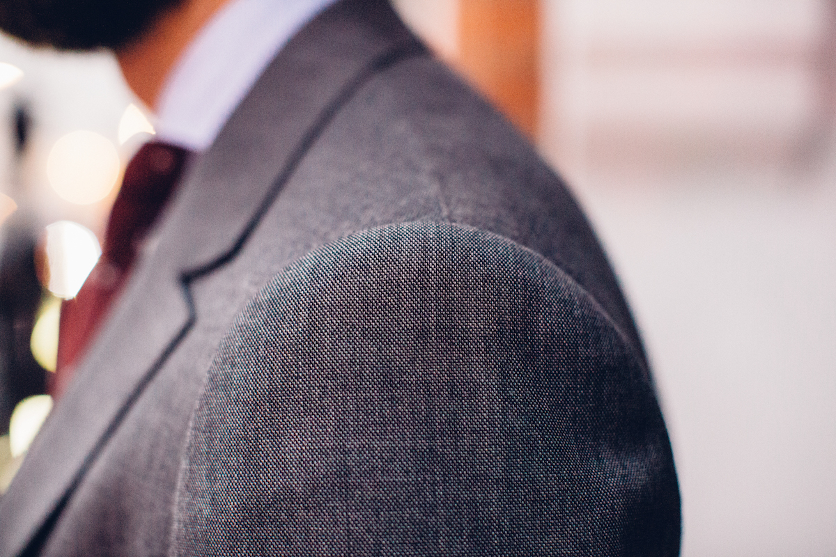
Generally, there are really two good categories of grey that can be worn for business: charcoal and mid-grey. Charcoal is a sober and professional, and works particularly well in flannel, but (like navy) it cannot be mistaken for black.
Mid-grey, however, is kindest of all the suit colours on skin tones – it compliments a good tan, but it doesn’t wash out the pasty. It is for that reason that I would recommend creating a business wardrobe (or commissioning their your bespoke suits) in navy, charcoal and mid-grey.
Mid-grey might feel a little adventurous. It is a touch lighter than the grey suit you would instinctively buy for business.
Don’t be afraid – it will look perfectly serious with a blue shirt, dark tie and deep-brown Oxfords. But it will also work wonderfully in a casual summer setting, with a white shirt, mid-brown shoes and perhaps a white linen handkerchief.
Further reading
Reader question: Building a wardrobe
An exercise in wardrobe building
Jackets and casual colours
The most useful jacket for business is likely to be a navy blazer, but how acceptable this is will vary considerably between offices. Nice options beyond that for jackets will largely be muted ones such as a pale oatmeal colour or greys.
Going beyond business attire – or for more casual offices – will take you into the areas of brown, green and various shades of tan. These can seem rather daring until you look at tweed – the casual attire of traditional English dress and most commonly in shades of green or brown.
Both can work in suits or jackets in any material, but remember that lighter colours and stronger colours are more casual. So in a suit, both brown and green should have a touch of the grey about them, and they should be dark enough to look designed for work, not play.
Further reading
Should I pick a pattern?
If you’re commissioning your first suit, make it plain. There’s enough to worry about with fit, style and colour, without chucking pattern into the mix as well.
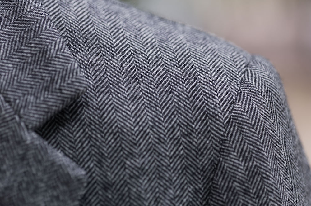
But, plain is rarely plain with worsted wool (the material most business suits are made of). There are nailhead and pick-and-pick, both of which most men would just describe as plain, and even some herringbone patterns go unnoticed.
In general, a little surface detail is a good thing. Unless the desired look is ultra-smooth and sleek, texture adds to the interest of a suit and contrasts nicely with the shine of a tie. So consider those little patterns to be nothing more than texture.
Herringbone is often a good option for a second or third suit; essentially a broken twill, it adds a touch of interest without sacrificing seriousness.
Simple, long stripes
If you do want a pattern, I’d also suggest starting conservative.
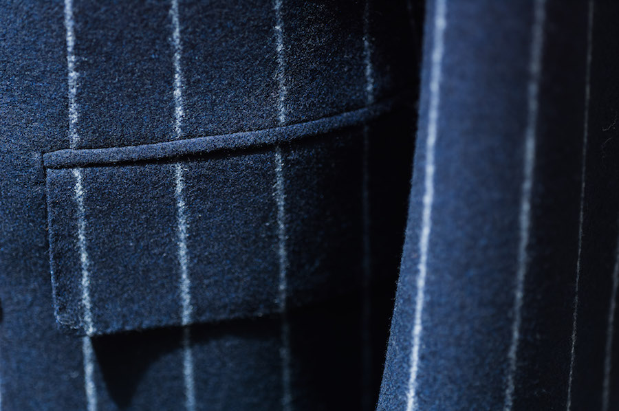
With stripes, most you see are pinstripe: a thin line of white or a similarly pale colour that contrasts with the background. It’s easy to see how to go wrong here – a stripe that is strong, wide or widely spaced will be tempting, but threaten to look unprofessional, verging on Wall Street caricature.
Equally, though, the stripe should not be so dense as to be nothing more than texture. It’s such a waste.
The nice thing about stripes is they give an impression of height and therefore flatter shorter men. Unless you are freakishly tall, though, they will not look bad on a big man. The lengthening effect is far greater than the slimming one.
Another popular option is chalk stripe. This is wider and usually used on flannel, creating a fuzziness to the line that is both classic and flattering. Try it on a blue suit and team it with sober accessories. Not rakish, but still full of personality.

Types of check
The king of the check is the Glenurquhart plaid, often reduced to simply glen plaid. This is a check of several overlapping lines that was made famous by Edward VII, who created his own version when Prince of Wales (a glen check with an overcheck is often referred to as a Prince of Wales check). The Duke of Windsor popularized the pattern during his travels to the US.
At its faintest, this check is mere surface interest; at its strongest, it is old-fashioned sportswear and unsuitable for business. The difference is both in the size of the check and the tone of the grey (or occasionally blue) that it is set against. Start with a mid-grey and then experiment.
The real fun though, is the overchecks. This is a simple, single line that follows the undercheck but outlines it, adding a subtle touch of colour to the pattern. Blue is standard and safe, lime green is surprisingly popular, and pink also pops up now and again. But the king is a rusty orange. Try it on your fifth suit.
Last are windowpane checks. A simple pattern created by single lines, this plaid can again vary enormously in its effect from anonymity to recklessness. A good idea would be to start with a large but faint windowpane on a charcoal ground.
Further reading
The guide to weaves and designs
Camps de Luca pick-and-pick suit
